R/RStudio 2
Tidying up with dplyr & ggplot
Introduction
When using R and RStudio you'll find yourself using imported packages very frequently. There are so many shortcuts and easy tricks that have been developed and put into packages for our use, it'd be a waste not to utilize them. The most notable package is called tidyverse. Tidyverse is a sort of compilation of all of the most useful packages for "tidying" data. While there are many useful packages contained in the tidyverse, today we will be dipping our feet into two packages exclusively: dplyr and ggplot. These are also two of the most frequently used packages within statistics courses here at UW Madison, so they're great to be somewhat familiar with.
Installing R Packages
Installing 'tidyverse'
To get started we're going to run a couple of lines of codes to install the tidyverse packages and load them into your RStudio.
- First write install.packages("tidyverse") and hit Enter/Return. You'll have to run the first line and wait a second until it's finished installing before you run the next line to access tidyverse.
- Then write library(tidyverse)and hit Enter/Return
install.packages("tidyverse")

library(tidyverse)
Installing 'nycflights13'
Before we can go through the basic functions of dplyr within the tidyverse package, we will need to load in a dataframe for us to test our functions on. For this workshop, we will download the dataframe "nycflights13"
- First write install.packages("nycflights13") and press Enter/Return.
- Then write library (nycflights13) and press Enter/Return
install.packages("nycflights13")

library(nycflights13)
After running this code we should have access to the flights dataframe. Go ahead and just assign flights to a variable so we can open the dataframe and see what kind of data we have. The following code will assign the flights dataframe in the package we just installed into a dataframe we can use.
flights = flights
Now we should be able to click on our dataframe in our environment to take a look at it. We have day, month, and year variables, variables denoting air travel time, departure delay time, arrival delay time, etc. It's a very huge dataframe. Obviously there is tons of information we can siphon from this, however just looking through this huge dataframe as it stands is time consuming and inefficient. Thus we use our dplyr functions to help us get to what we want out of our dataframe.
DPLYR
Once we've installed our packages, we can access any and all functions that exist within them. So without further ado, let's start by exploring some of the features of dplyr!
Dplyr
Dplyr gives us tools necessary to manipulate any dataframe in almost any way imaginable with very little hassle.
filter()
The first function we'll be exploring is the filter() function.
When should we use filter()?
Take a look at the nycflights13 dataframe we've loaded in. With so much data there is a huge variety of observations we can analyze, however if we want to more accurately analyze certain specific observations, sifting through the entire dataframe will only be a nuisance. This is why we filter our data.
filter() gives you a subset of your dataframe specific to certain valued observations.
the notation is:
filter(dataframe, observation == value, ... )
Our first input is just the dataframe we want to filter, you'll notice the first input remains the same for all of our DPLYR functions. The following input are what we want our new dataframe to filter.
This may not make a lot of sense right now, so let's work through some examples to see how filter() works.
Run the following code example:
filtered.flights = filter(flights, month == 1, day == 1)
This line of code will filter our original flights data frame into a smaller dataset only containing observations occurring on January 1st and assign it to a new variable, filtered.flights.
View the flights data frame and compare to our new filtered.flights dataframe we've just created. You should be able to see clearly how the filter() function altered our dataframe.

Some more important details:
Make sure to use == instead of =, as using just = will give you an error. Also note you can use | (or) and & (and) when using filter(), here's an example :
Run the following code example:
filtered.flights2 = filter(flights, month == 1 | month ==2)
We're using our "or" operator in this example. How would you describe this new dataframe we've filtered?
If you said that this line of code will return a dataframe specifically concerning observations occurring in January or February, you'd be correct!
When filtering we can also use any comparison operators , such as
<, >
,
<=, and >=
to give us more flexibility with exactly what we want to filter!
Run this code example to use our comparison operators:
filtered.flights3 = filter(flights, month <= 3, day ==1)
This function will give us our flights dataframe exclusively looking at the first day of each of the first 3 months. We are taking all months less than or equal to 3, then we specify we want to look at the first day.
arrange()
The arrange() works very similarly to the filter() function.
Rather than create a new dataframe that serves as a subset, arrange() simply rearranges columns within our dataframe into a specified order.
the notation is:
arrange(dataframe, observation, ...)
As we did with filter() we will lead with our dataframe, and our next input is the observation, or the column, that we wish to arrange.
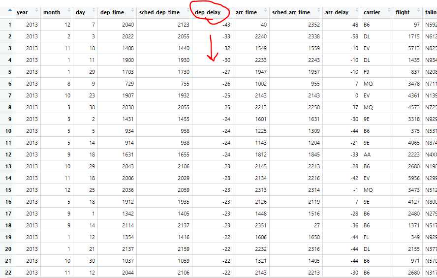
For example, the following code will arrange the departure delay column in ascending order:
arranged.flights = arrange(flights, dep_delay)
Feel free to compare our new arranged.flights dataframe to the nycflights dataframe and observe the difference.
While our DPLYR functions are very useful, we can combine them with other functions to make them even more versatile!
One very useful function to use alongside arrange() is the desc() function.
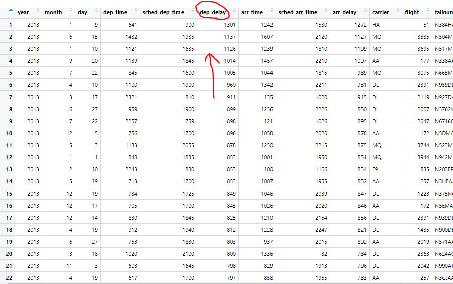
desc() will simply rearrange an observation into descending order. So while normally putting an observation into the arrange() function will rearrange into an ascending order, if you wrap the observation in the desc() function it will output in descending order instead.
For example, let's run the following code:
arranged.flights3 = arrange(flights, desc(dep_delay))
This is the same code we used earlier, however we put desc() around our year observation, therefore this will rearrange our data frame in the same way, just in reverse order, starting with the largest departure delay in our dataframe.
select()
Our select() function allows us to look at a very specific subset of variables within a data frame. Some data frames can have thousands of variables, so the ability to pick only a select few we’re interested in is very valuable.
the notation is:
select(dataframe, variable_of_interest, …)
Once again, our first input is the dataframe we wish to select from. We follow this with whichever variable/column we want to select from our dataframe.
Let's start by running the following code.
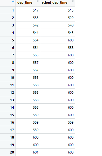
selected.flights = select(flights, dep_time, sched_dep_time)
Here we are choosing to only select the departing time, and the scheduled departure time. If we needed to do specific analysis on the difference between these two variables it would be very useful for us to isolate them and look at this new subset. Take a look at our new dataframe selected.flights and see how our code altered the original dataframe
A very neat function you can use in junction with this function is wrapping -() around a variable.
This will select the entire dataframe EXCEPT for the variable(s) you included in the -().
To try it out in a line of code, run this:
selected.flights2 = select(flights, -(year))
This will give us our normal flights dataframe, however the year variable will no longer be there, although it may not be that useful in this circumstance, it’s just another way to manipulate your data that is useful to keep in mind.
DPLYR Activity 1
A Problem to Tackle Alone
a. Use the flights dataframe to create a more specific data frame only including the variables: year, month, day, dep_delay, and arr_delay.
b. Let’s say we’re only interested in data from the month of March. Take your new dataframe and manipulate it further so it’s reflective of this.
DPLYR Cont'd
mutate()
mutate() is an extremely useful function that allows us to add new variables that are functions of existing variables. This is extremely useful when a specific variable you want to research isn’t already in your dataframe.
The notation is:
mutate(data, new_variable = function_of_old_variables, …)
This function will be easiest explained with an example, run the following code.
- First I’m going to use select() to make an easier dataframe for us to visualize
selected.flights.m = select(flights, year, month, day, distance, air_time)
This dataframe contains only the year, month, day, distance, and air_time variables.
- Now I’m going to use our mutate() function to create a new variable, hours.
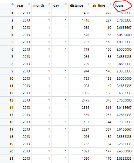
mutated.flights = mutate(selected.flights.m, hours = air_time / 60 )
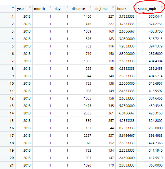
When we look at our newly mutated dataframe, we now have a new variable, which is just our air_time put into the unit of hours by dividing the entire column by 60.
With this new variable we can make another new variable, speed_mph.
- Let's mutate again, run the following code:
mutated.flights2 = mutate(mutated.flights, speed_mph = distance / hours)
This new line of code takes our distance column of observations and our newly created hours column of observation and divides them to give us a new variable, the speed of each observation, which can be incredibly useful. We can use this new variable in any further analysis or plotting we might want to put this dataframe through.
transmute()
Our next function, transmute() is essentially a combination of select() and mutate(). You use this function the same way you would use mutate(), to create new variables, however, rather than adding the new variables to the previous dataframe, this creates a new dataframe only containing your newly defined variables.
transmute() actually allows us to do what we did in our last example in fewer steps.
Let's start by running this code:
transmuted.flights = transmute(flights, year, month, day, distance, air_time, hours = air_time / 60)
This code quite literally combines the first two lines of codes we ran in our mutate() examples. We begin by inputting all of our variables we'll be "selecting" for our new dataframe, and at the end we add a new variable, a mutated variable, the same one we did in our last example. Compare this transmuted.flights dataframe to our mutated.flights dataframe, and spot the similarities.
summarise()
The summarise() function is probably the most complex of the basic DPLYR commands. It collapses an entire dataframe into a single row.
This single row summarization is based on one specific function of interest
As we are trying to summarise, we need to provide a function to summarise our data with, for this example we will be summarising using the mean, which is the most common use with the summarise() function.
Let's start with an example to show what I mean by summarising the mean:
summarised.flights = summarise(flights, mean(arr_delay, na.rm = TRUE))
Now what this code is doing, is taking our column of arrival delays, and collapsing the entire column into one mean value. This will literally result in a new column containing only one value. Our mean. When manipulating dataframes, this isn't useful at all. If we wanted to find the mean of a column we could just use the mean() function by itself. Thankfully once again we have some other functions we can use in conjunction with our main summarise() function, that will greatly expand its utility.
This magical function that allows summarise() to shine is the group_by() function.
The group_by function redefines a table so that all operations done are in respect to the “groups” created.
It's easiest explained by an example, run the following code:
grouped.flights = group_by(flights, year, month, day)
This function will create our new dataframe which is grouped based on the date (year, month, day). Now we will run the same summarise function we used earlier, however on our grouped dataframe:
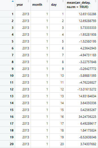
summarised.flights2 = summarise(grouped.flights, mean(arr_delay, na.rm = TRUE))
Because our dataframe is now grouped, instead of summarise() collapsing our arrival delay into a single row, it collapses it into the groups we’ve specified. Our new dataframe will show us the mean arrival delay for each respective date (year, month, day).
Let's take a look at our new summarised.flights2 dataframe to fully understand what our function did.
Now let's do one more quick example using the summarise() function:
summarised.flights3 = summarise(grouped.flights, mean(dep_delay, na.rm = TRUE))
This will operate in the same way our last line of code did, however this will give us the average departure delay for each date (year, month, day)
DPLYR Activity 2
A Problem to Tackle Alone
a. Use the flights dataframe, create a more specific dataframe only including variables year, month, day, dep_delay, arr_delay, tailnum, and a new variable: total_delay, which will be defined as the sum or dep_delay and arr_delay. Name this new dataframe df.a.
b. Using your new df.a create another new dataframe that shows us the average total_delay per each tailnum. Name this dataframe df.b hint: this part requires two functions
Using Pipelines: %>%
When using dplyr we may end up needing to use several functions to get our dataframe exactly where we want it.
When several functions are needed, to stay organized, it’s helpful to run all of our code in one nice and neat chunk
We do this using pipelines, which can be expressed as %>%
Essentially pipelines are a way to shorten your code, and make it flow and run in one single chunk.
The best way to explain it is with examples:
The first place we would usually use our pipeline is with our initial dataframe.
Run and examine this code:
filtered.piped.flights = flights %>%
        filter(month == 1, day == 1)
This code will do the exact same thing as the first function we used as our example for the filter() function, however notice how it is written.
\
We define our dataframe first. By starting with our dataframe and a pipeline, we are telling R that whatever function is called next, we are calling it onto this dataframe we are putting through the pipeline. Notice how, unlike all previous examples, within the function filter() we are not stating flights as an argument, we are only giving it month, and day. The flights dataframe comes through the pipeline.
Now let’s try pipelines on an example using 2 lines of code, our summarize() and groupby() functions.
summarised.piped.flights = flights %>%
    group_by(year, month, day) %>%
    summarise(mean(arr_delay, na.rm = TRUE))
This code will do the same thing as the example we looked at previously, however note what the pipelines are doing. Similarly to our last example, we are putting the flights dataframe into the pipeline, that dataframe is put through the group_by() function, and then the new dataframe created by the group_by() function, is sent through the pipeline again, and it is put through the last function, the summarise() function. So previously, what was two lines of code to be run separately, is now one fluid chunk, that will run all at once.
And for one final example, I will show the last independent practice problem we did, and how to write it using pipelines.
df.a.b = flights %>%
    transmute(year, month, day, dep_delay, arr_delay, tailnum, total_delay = dep_delay + arr_delay) %>%
    group_by(tailnum) %>%
    summarise(mean(total_delay, na.rm = TRUE)
This will run all parts of the problem as if it were just one nice fluid line of code. The major things to takeaway for pipelines is, initially start with your dataframe, don’t forget to add a pipeline after every line you’re stringing together, and you do not need to add the dataframe as an argument in any of the functions you’re putting the pipeline through.
Also pro-tip: ctrl-shift-m, or on Mac cmd-shift-m is a hotkey that will place a pipeline for you if you don’t want to type it out.
GGPLOT Basics
While we are looking at ggplot(), let’s introduce a new, smaller dataframe to work with.
enter the code:
data(mpg)
This dataframe contains various observations collected by the US Environmental Protection Agency on 38 models of car.
starting off very simply with just:
ggplot()
ggplot on its own doesn’t show us anything. It simply lays the groundwork of our graph.
if we run this code:
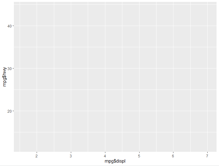
ggplot() + aes(x= mpg$displ, y= mpg$hwy)
For every aspect of our graph we add, we denote it with the +. Here we are telling our groundwork that we want our X axis to look at engine displacement, and our Y axis to look at highway miles per gallon, you’ll notice our graph now has values on the axises, however there is still nothing being graphed.
There are many different ways to create interesting visualizations with ggplot, and countless nuanced graphics to create, however for the purpose of this lesson we’ll just be looking at the two most basic. If you want to learn more, google is your best friend!
Now we will introduce, geom_point()
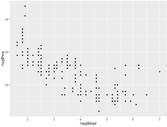
This is used to create scatter plots, or more simply just display our data as points on our ggplot.
Let’s take our code we used earlier to create a base graph, but add a geom_point():
ggplot() + aes(x= mpg$displ,y= mpg$hwy) + geom_point()
Run this example and you will see the same framework we created with the original ggplot(), however now that we have added geom_point() we have a scatter plot distribution.
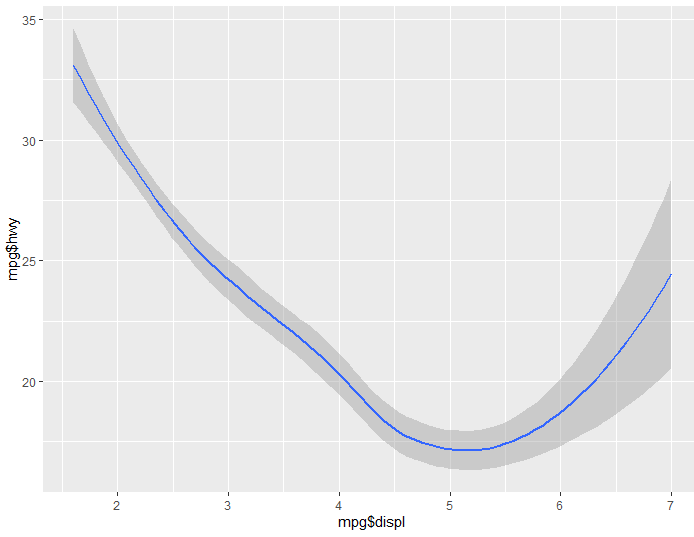
Now let’s try the same code, but instead of geom_point(), we’ll use geom_smooth()
ggplot() + aes(x= mpg$displ, y= mpg$hwy) + geom_smooth()
You will notice geom_smooth gives us a nice “smooth” visualization demonstrating the trend seen in the data. You’ll notice there’s even a nice shadow surrounding the line which represents the variance of the data.
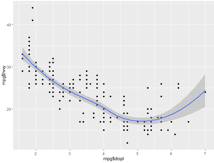
Finally for a last example, let’s see what happens if we use both of these:
ggplot() + aes(x= mpg$displ, y= mpg$hwy) + geom_point() + geom_smooth()
Since we called for both geom_point(), and geom_smooth(), we get both displayed on our graph. Sometimes overlaying multiple facets on a graph like this can get overcrowded, however, in this instance it seems to give us a really good idea of these two observations relationship
Activity 3
Refer to the RMD file in class files for final activity bridging all the parts.
